

Optimizing user flow
for a credit card reward tracking platform
Simplifying user flow for KardoAI, a credit card rewards tracking app
Context
KardoAI is a platform designed to help users track and maximize their credit card rewards efficiently. However, the user experience within the app was facing challenges in clarity and ease of use. The goal was to address pain points, improve usability, and create a clear path for users to not only track their rewards but also understand how to maximize them.
For my proposal, I focused on refining key elements of the app’s user journey. I aimed to redesign the app’s interface and interaction flow to elevate the user experience, showcasing how KardoAI can be better understood, more accessible, and ultimately, more useful for its users.
-
User Flow, UI, Rapid Prototyping
-
Divyanshi
-
2 weeks
Tools

Challenge
When I first engaged with KardoAI, the primary challenges were evident:
01
Complex interface
The onboarding process was unclear, leaving users confused about app features. The cluttered homepage overwhelmed users, hindering focus on key tasks like earning and using rewards.
02
Fragmented info
Users had to jump between multiple sections to find information, creating frustration and inefficiency, especially when making time-sensitive reward decisions.
03
Unclear process
Tracking and redeeming rewards was confusing, with users struggling to navigate options and unsure how to use their accumulated rewards.
Research & Discovery
To understand the problem in greater depth, I took the following steps:
User Interviews
I conducted a series of user interviews to identify pain points, frustrations, and desires. The common theme was that users struggled with a lack of guidance and clarity, especially when first using the app.
Competitive Analysis
I analyzed competitors in the personal finance and rewards tracking space to understand what was working and what wasn’t. It became clear that users needed a more streamlined, intuitive experience with clear calls to action and easy navigation.
Design Solution
01
Seamless Onboarding


02
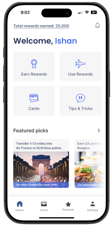
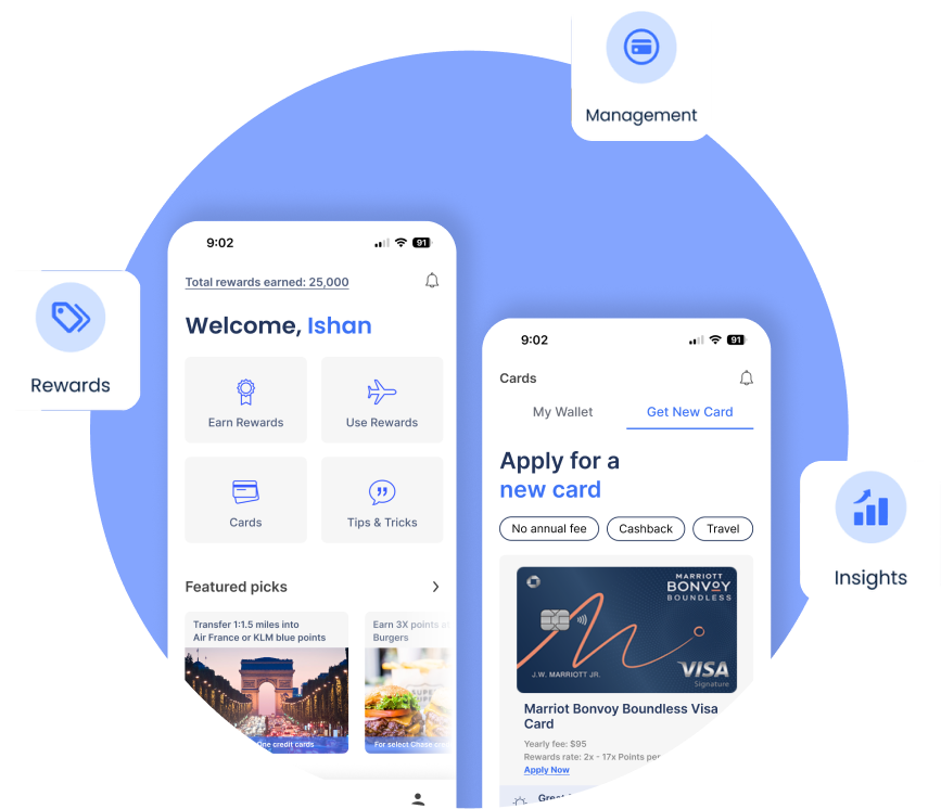
Simplified Homepage
03
One -stop shop: Cards section

04
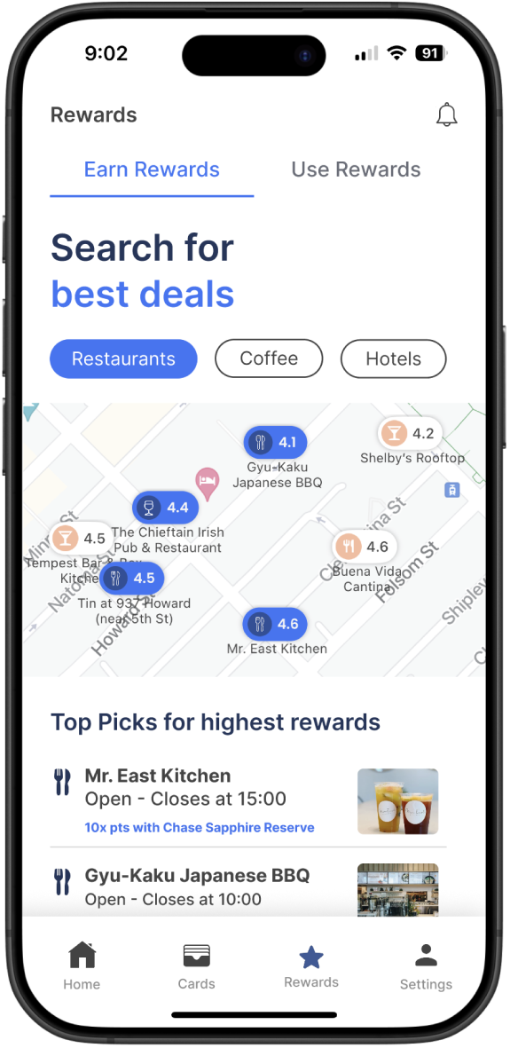
Easy-to-understand rewards section
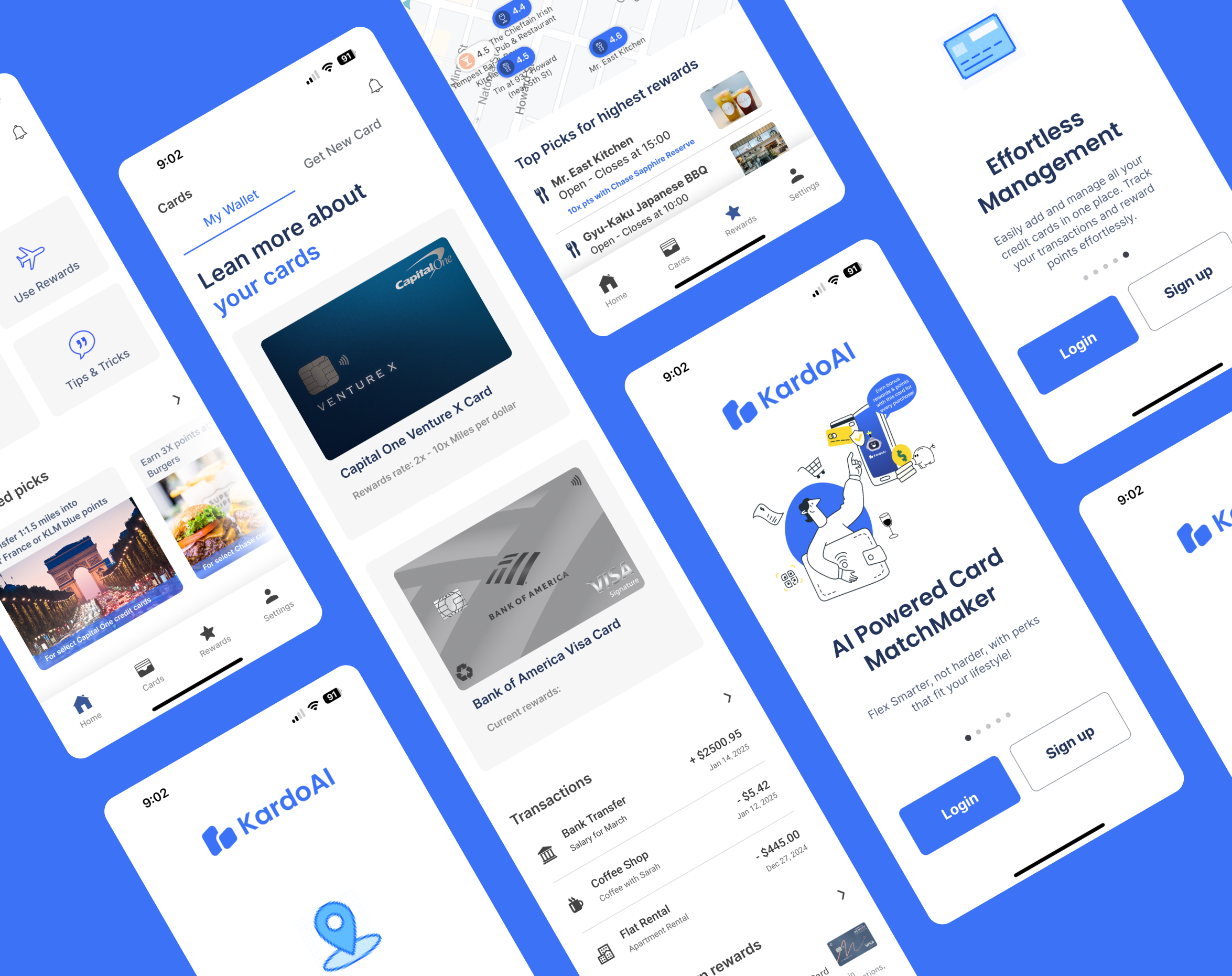
Approachable Interface
